
What stays consistent
Positioning discipline, message hierarchy, accurate claims, photography standards, layout control, accessibility, agent usability, and a clear buyer journey.
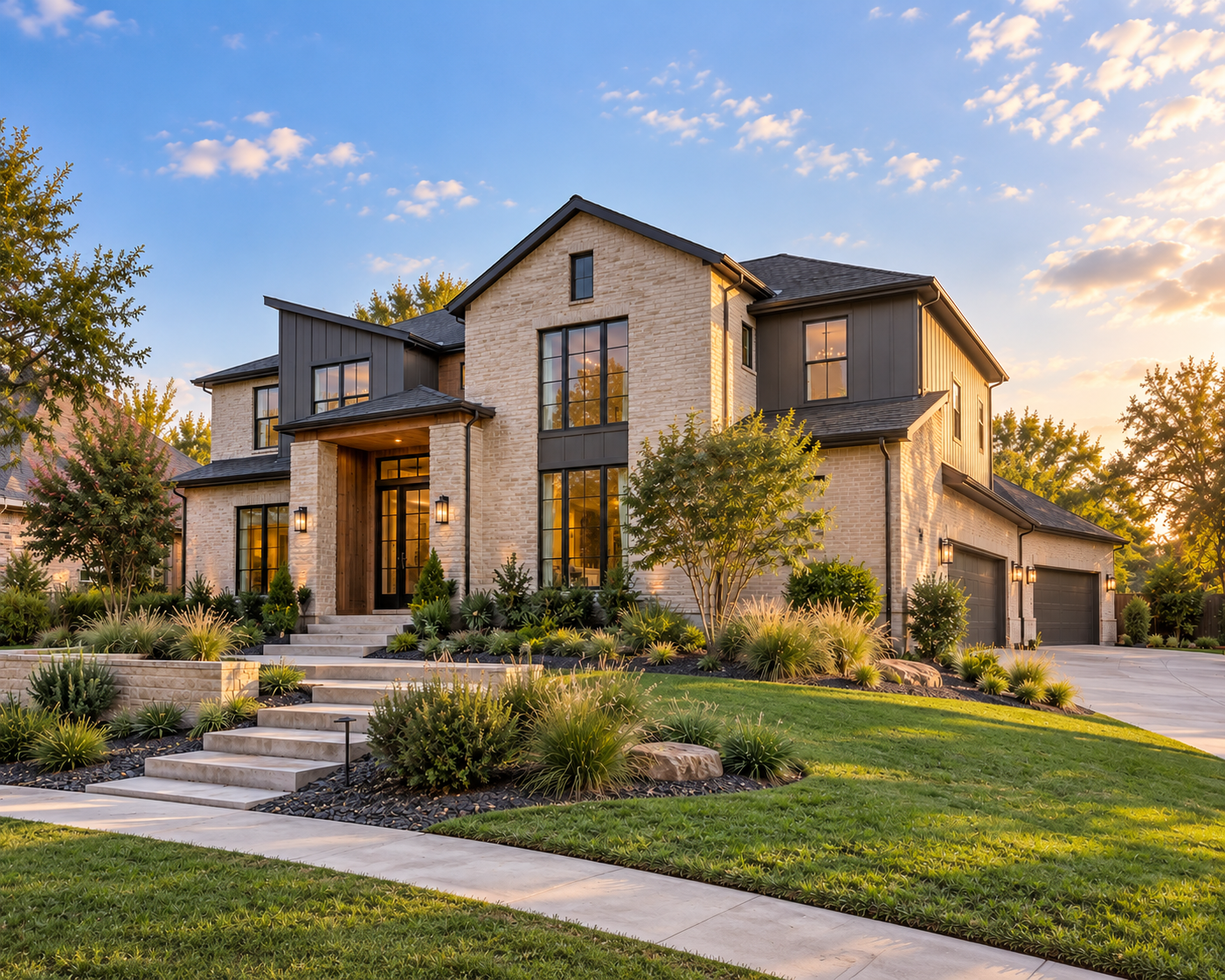
Founder portfolio / Self-initiated demonstration
One governed system across three market levels
The purpose is to prove that Craft + Code can preserve strategic discipline while changing the message, presentation, and channel emphasis to fit the property.
This is a self-initiated Craft + Code portfolio demonstration using fictional residential properties and portfolio-created campaign materials. It was not commissioned by a brokerage, developer, seller, or property owner, and it does not present hypothetical performance as a client result.
01 / Governing principle
Each campaign begins with the same strategic questions and produces the same core system. Luxury should not become empty glamour, and an entry-market property should never be treated as lesser work.
Positioning discipline, message hierarchy, accurate claims, photography standards, layout control, accessibility, agent usability, and a clear buyer journey.
Buyer motivation, property premise, visual pacing, information density, language, channel priority, and the moment when a buyer is asked to act.
02 / Three campaign expressions
Do not give the three campaigns unrelated personalities. They should feel like different applications of the same disciplined brokerage standard.
Luxury / Architecturally significant

Position a distinctive property as a considered private offering, not a collection of expensive features.
Buyer decision
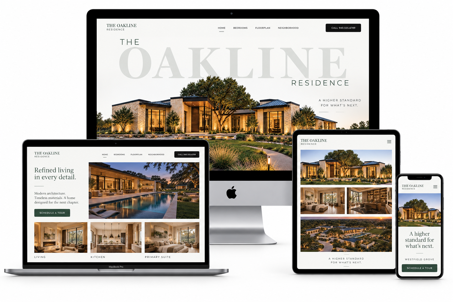
The digital presence introduces Oakline as a singular residential offering, then gives buyers a measured path through architecture, setting, interior experience, and private-tour access. The hierarchy remains consistent across desktop, laptop, tablet, and mobile.
Visual direction
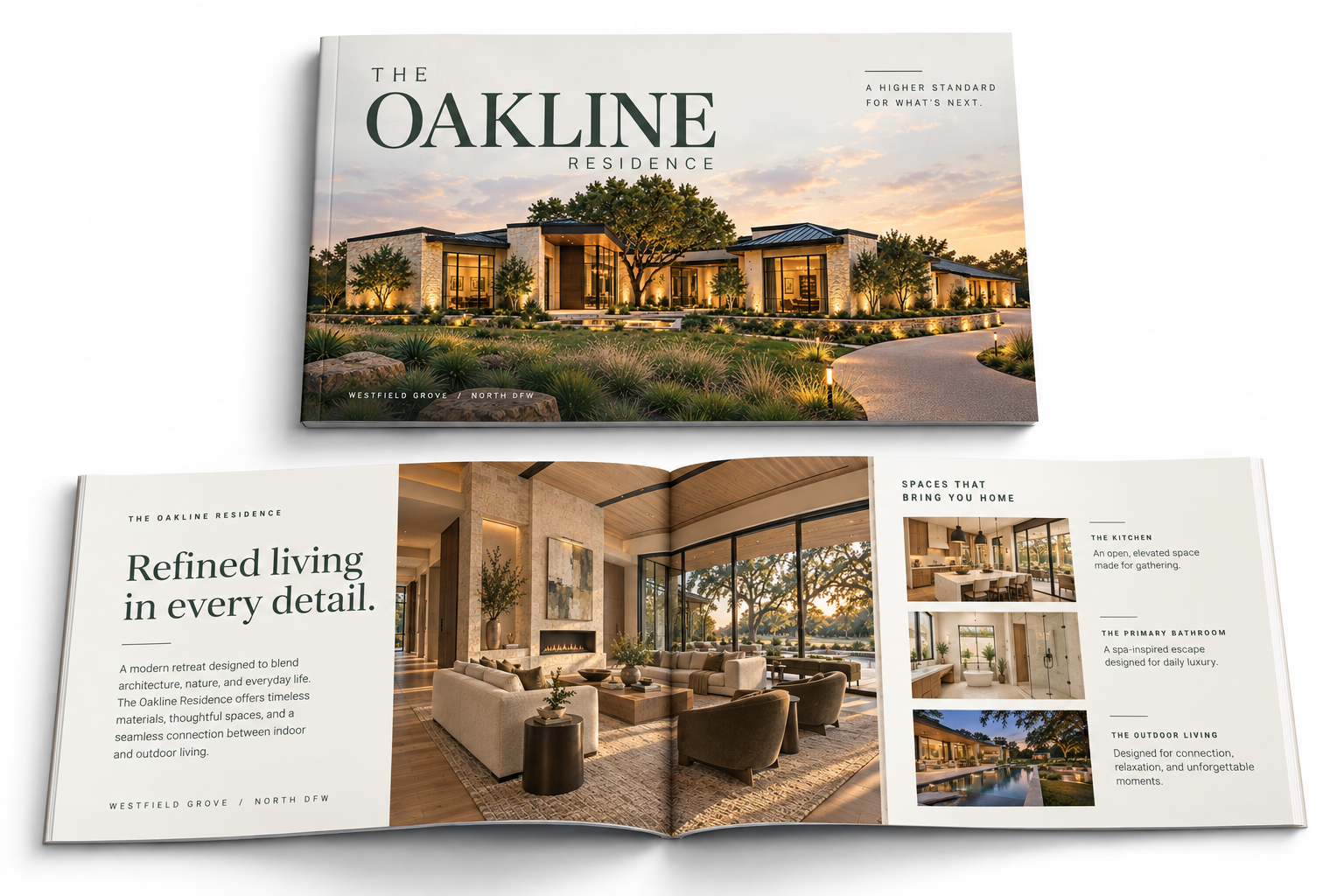
Cinematic dusk photography, deep green, warm ivory, precise typography, and generous negative space create a quiet sense of distinction. The brochure extends the same visual premise into a tactile, paced presentation of architecture and lived experience.
Message priority
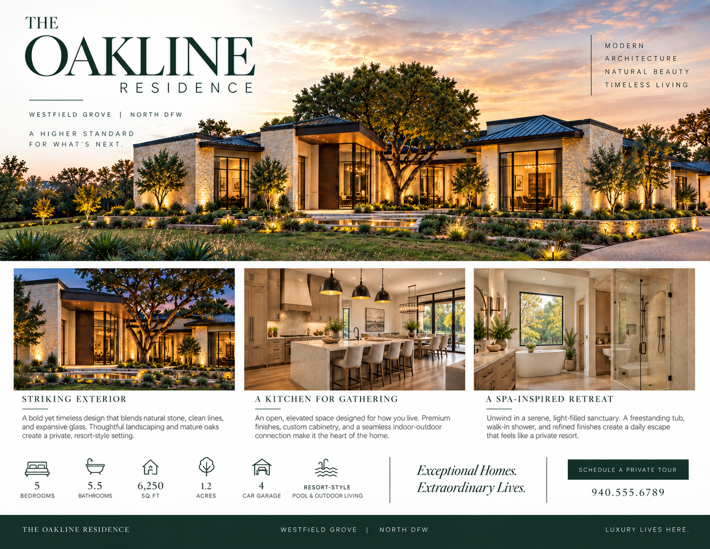
The campaign establishes Oakline through its governing idea before introducing the proof: modern architecture, natural beauty, 6,250 square feet, five bedrooms, five-and-a-half bathrooms, 1.2 acres, a four-car garage, and resort-style outdoor living.
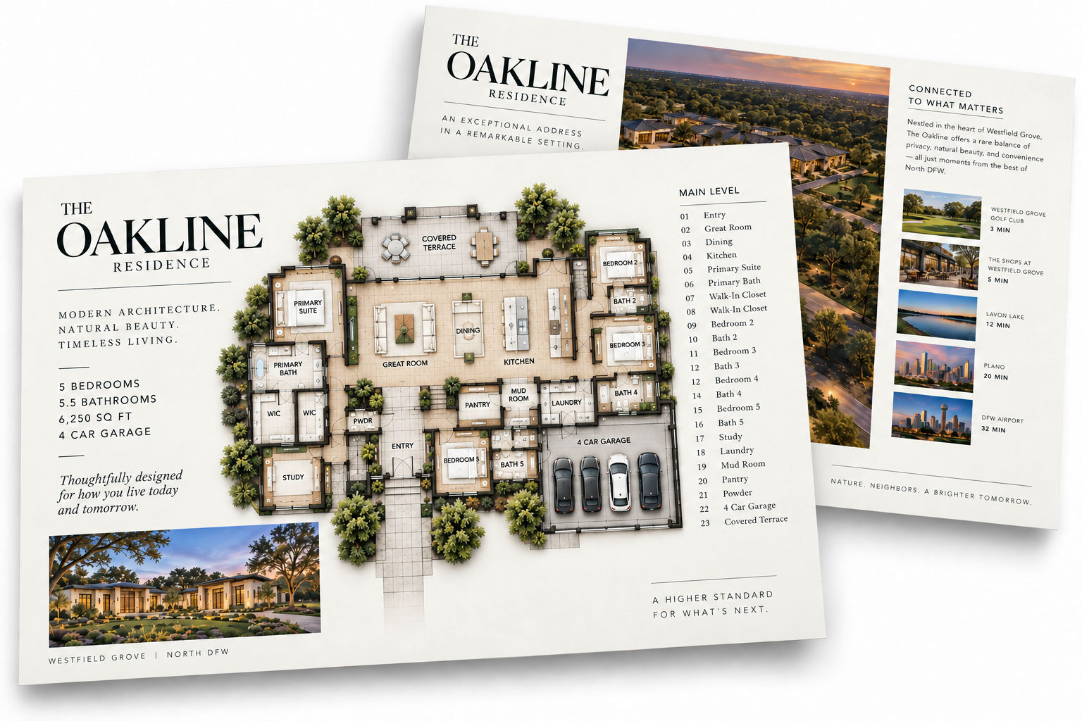
Channel emphasis
Social media and the digital newsletter build selective awareness while signage and direct property materials support discovery, arrival, and appointment-led action. Each channel performs a different role without changing the property story.
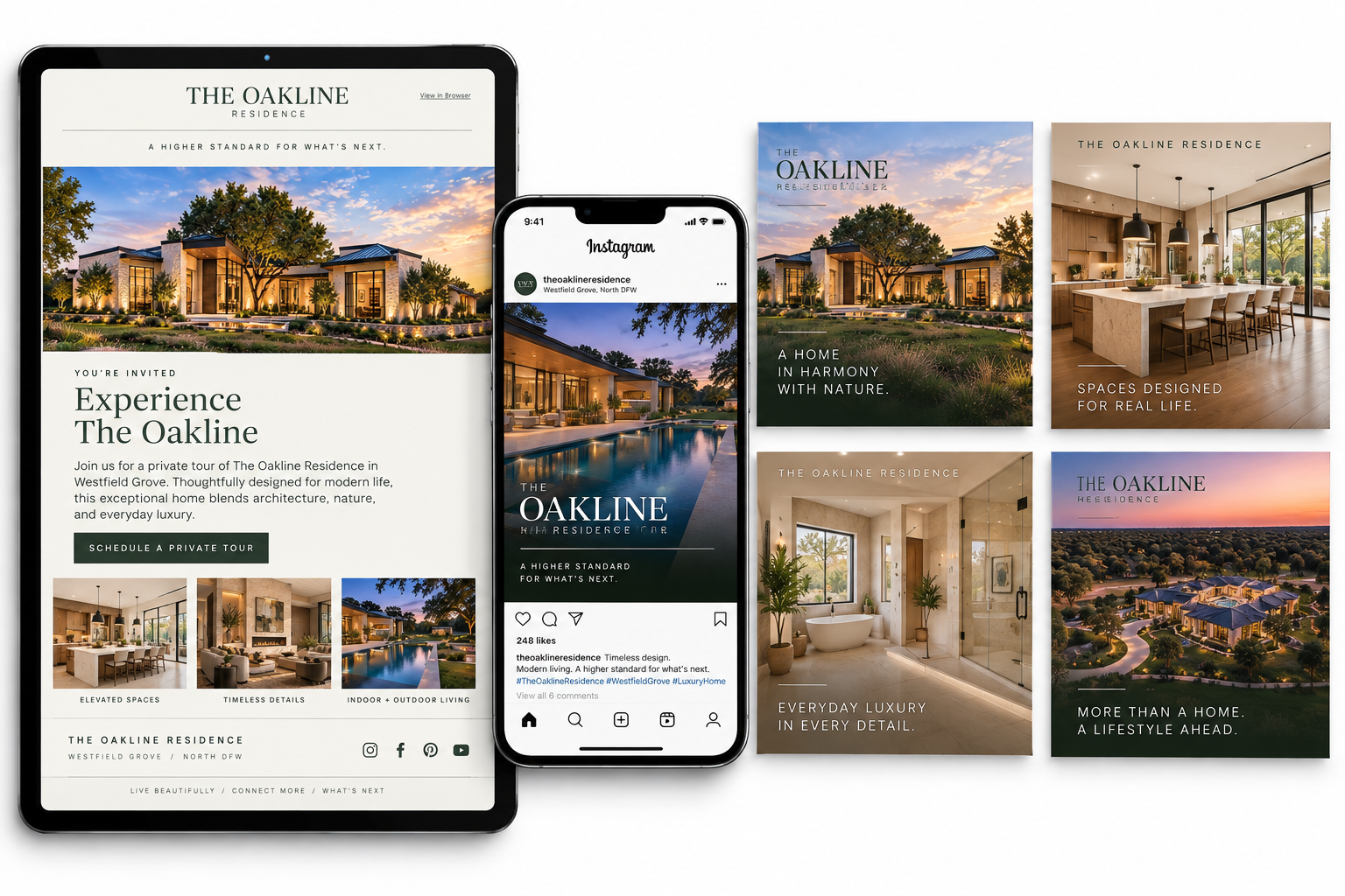
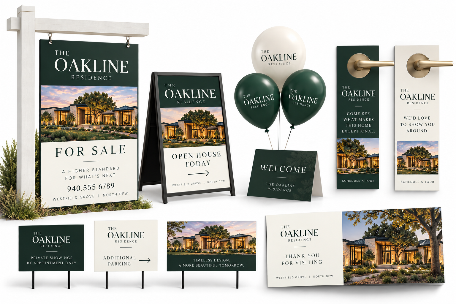
Complete integrated system
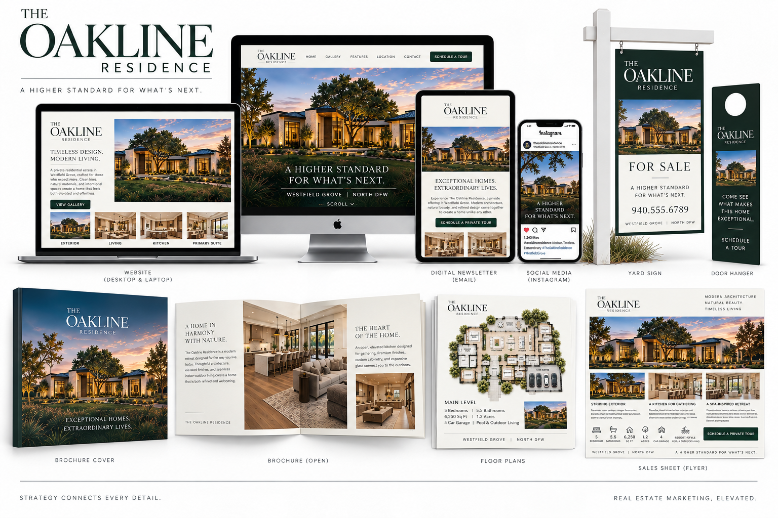
Established mid-market residence
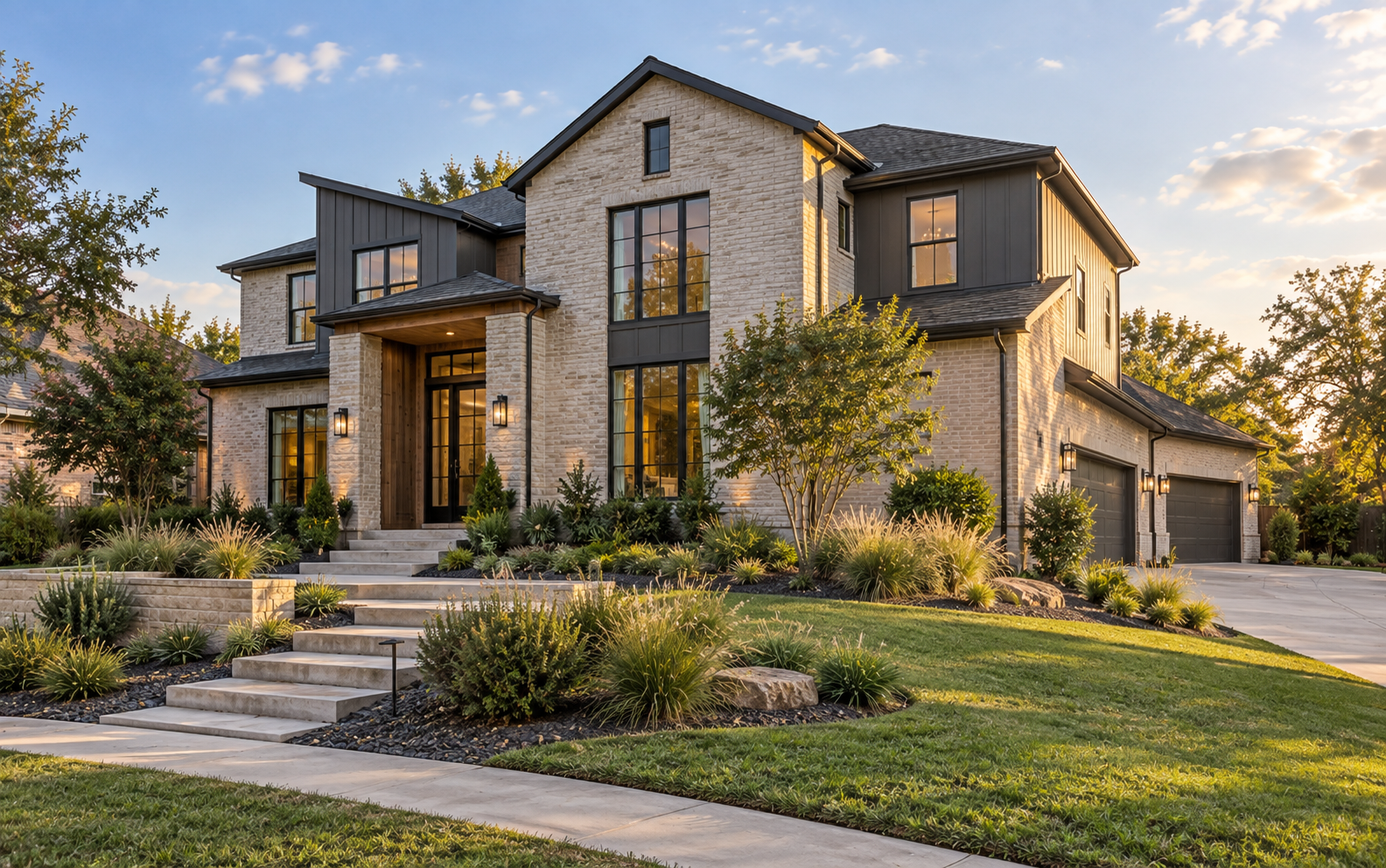
Translate a strong home into a clear lifestyle and value story for buyers making a consequential next move.
Buyer decision
The website gives buyers a controlled path from recognizing household pressure, to testing daily fit, to scheduling a visit. Desktop and mobile carry the same hierarchy without reducing the property to a list of features.
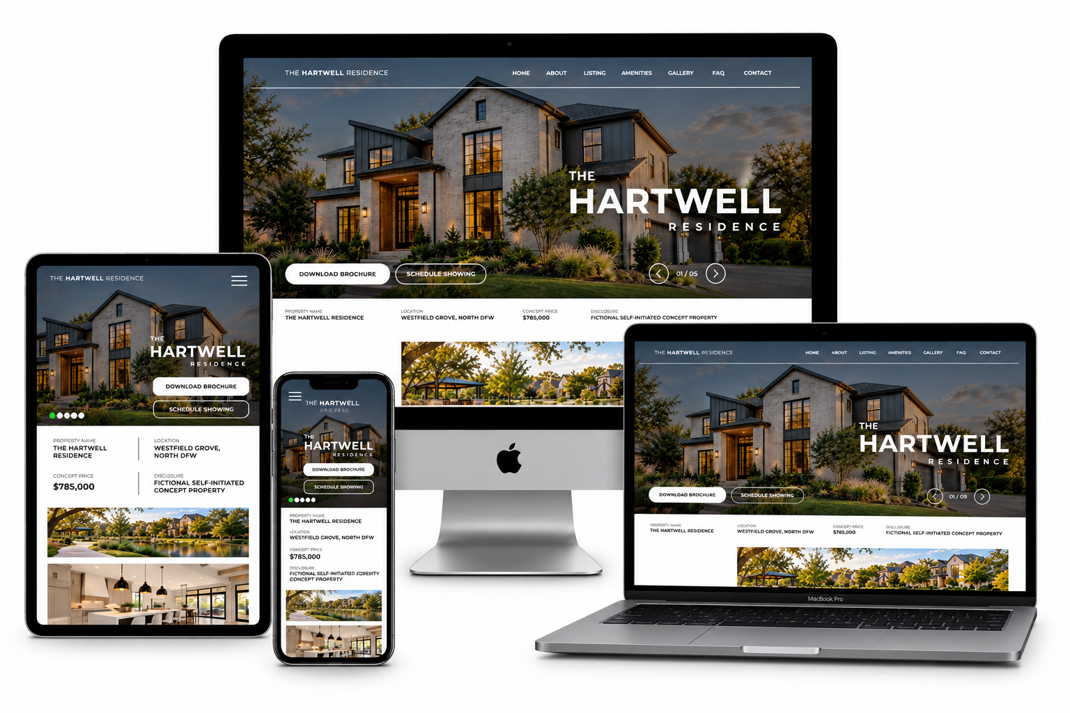
Visual direction
The campaign balances aspirational photography with practical information. Cream, charcoal, and deep green create continuity, while generous spacing and editorial typography keep the work polished without borrowing luxury cues from the Signature Property.
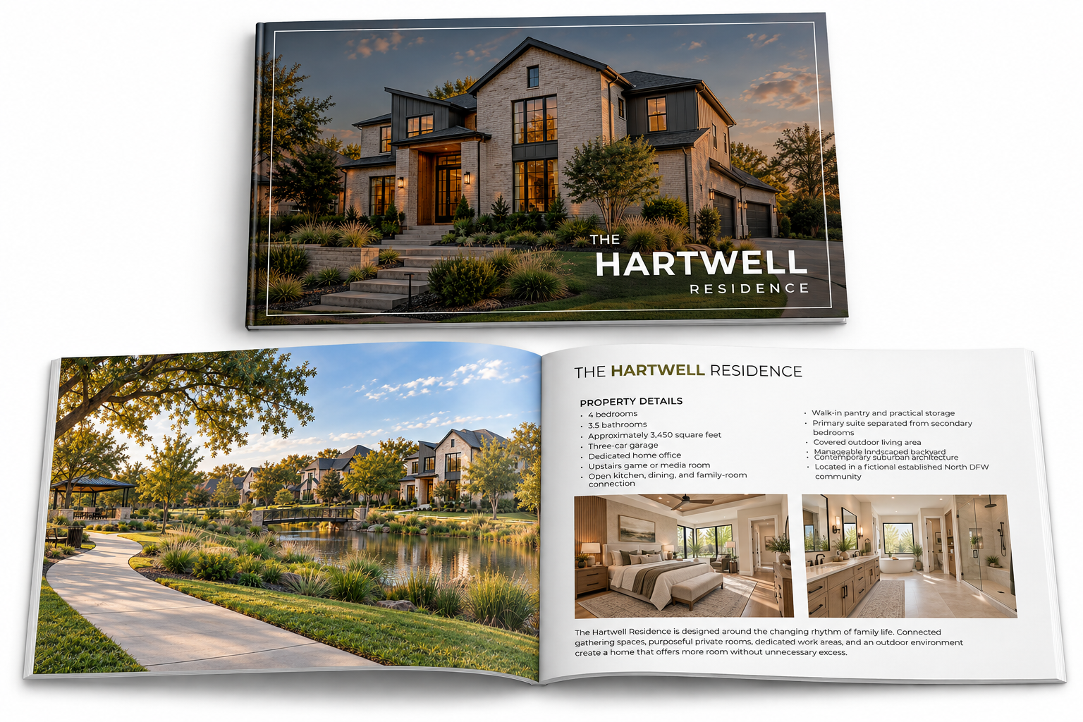
Message priority
The campaign leads with progression, then proves it through space planning, storage, family connection, outdoor living, and neighborhood usefulness. The floor plan and lifestyle guide make the message tangible without inventing a performance outcome.
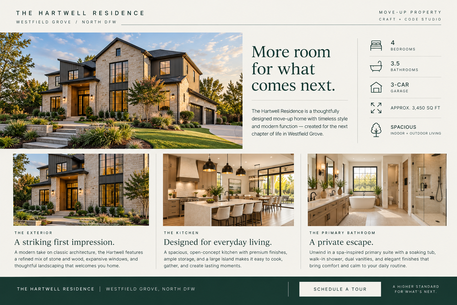
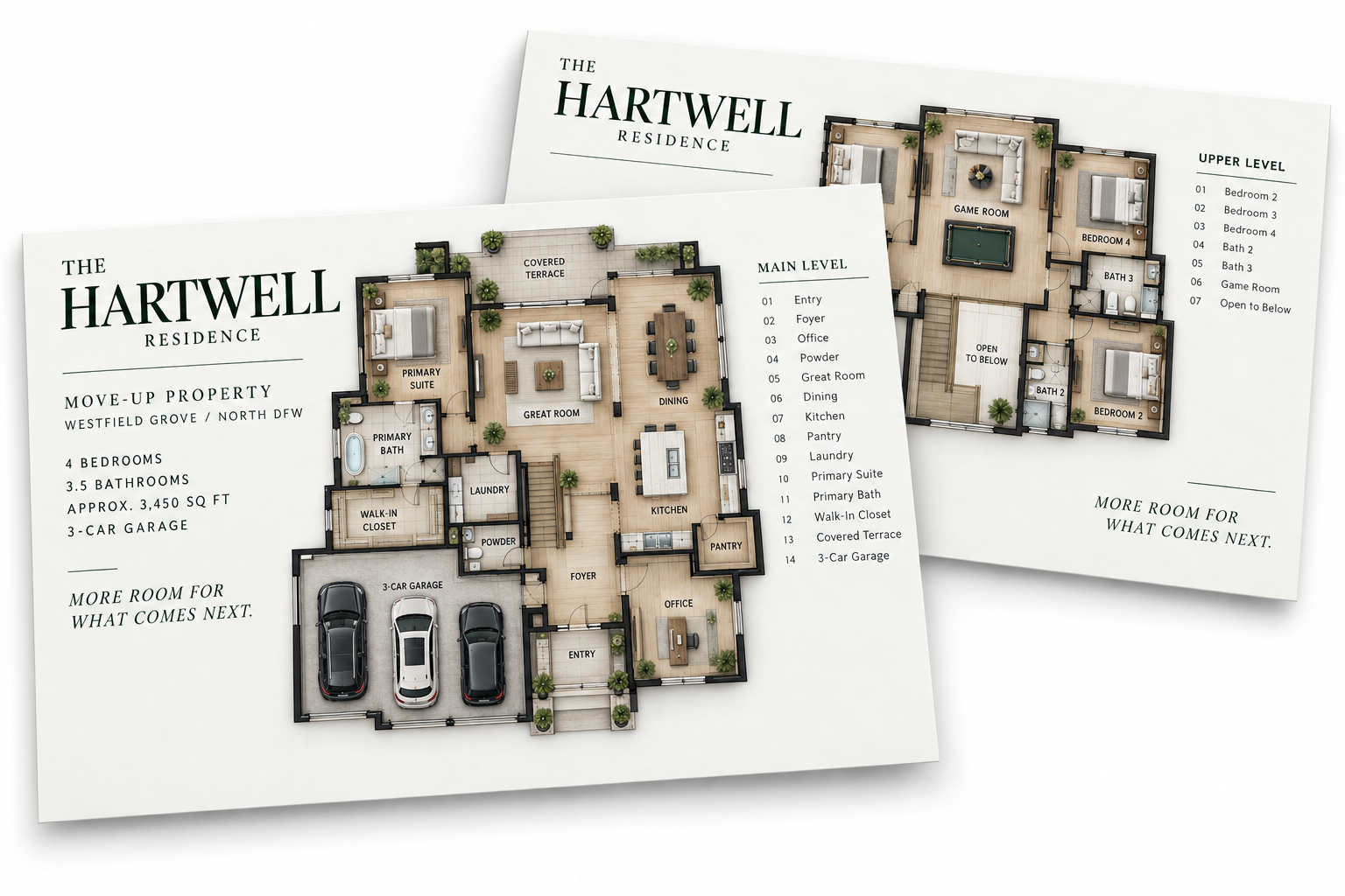
Channel emphasis
Email and social introduce the opportunity, signage converts local visibility into attendance, and the agent follow-up sheet protects momentum after the visit. Each channel has a specific job while remaining visibly part of one campaign.
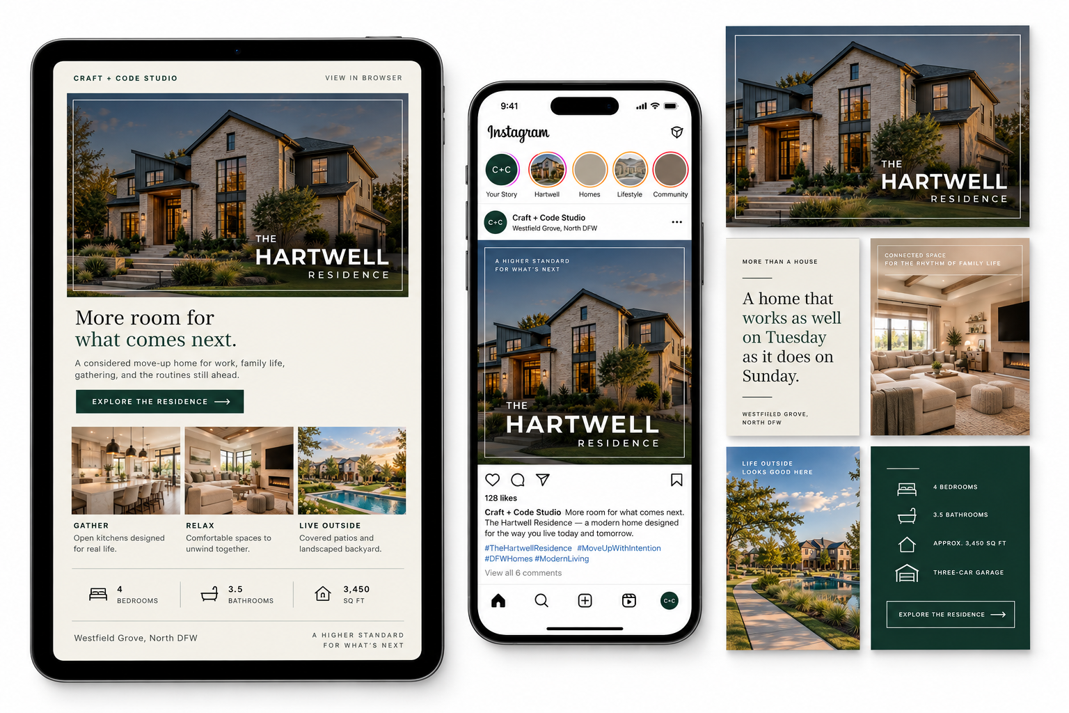
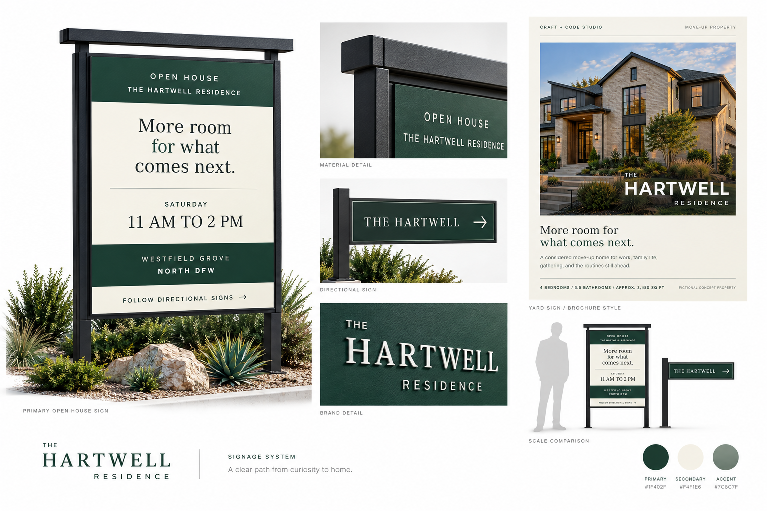
Complete integrated system
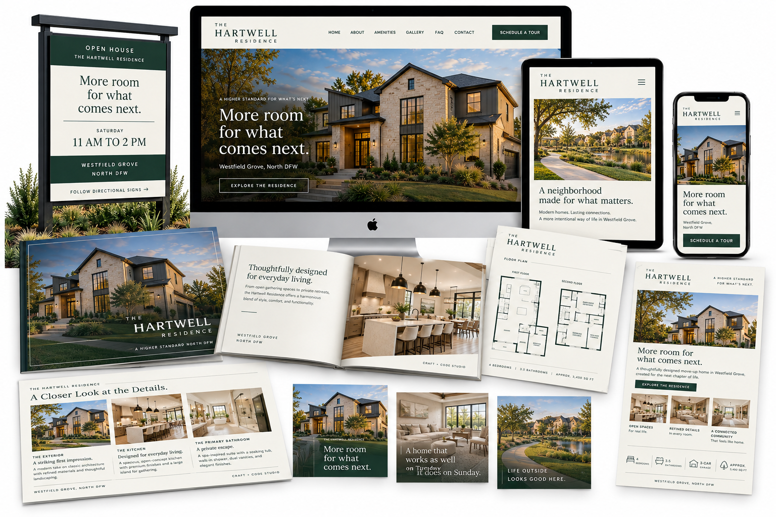
Entry-market residence
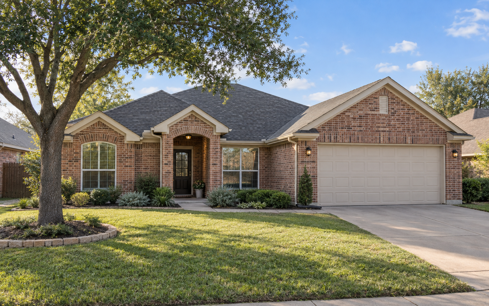
Make the buying opportunity understandable, credible, and welcoming without making the property feel inexpensive or disposable.
Buyer decision
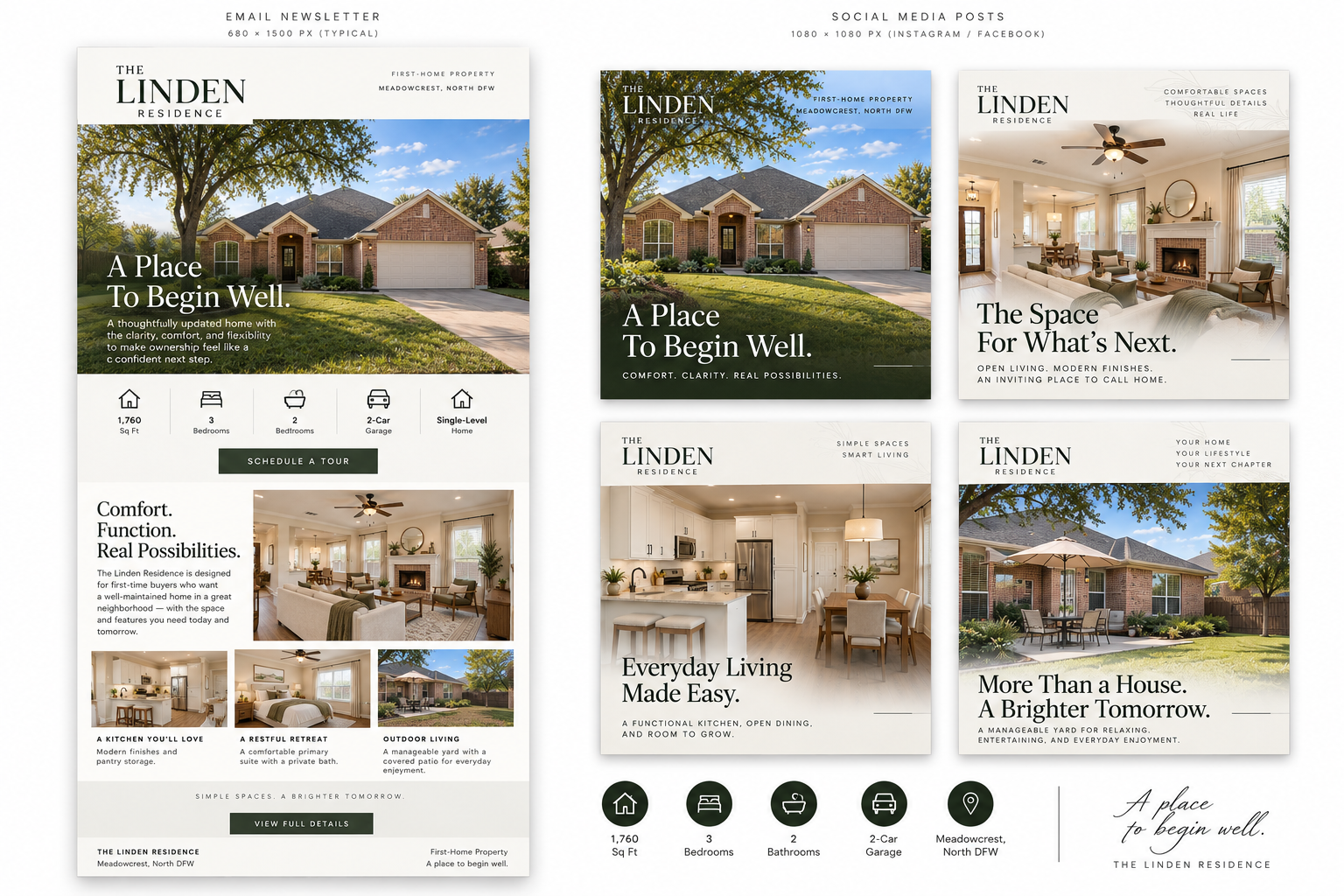
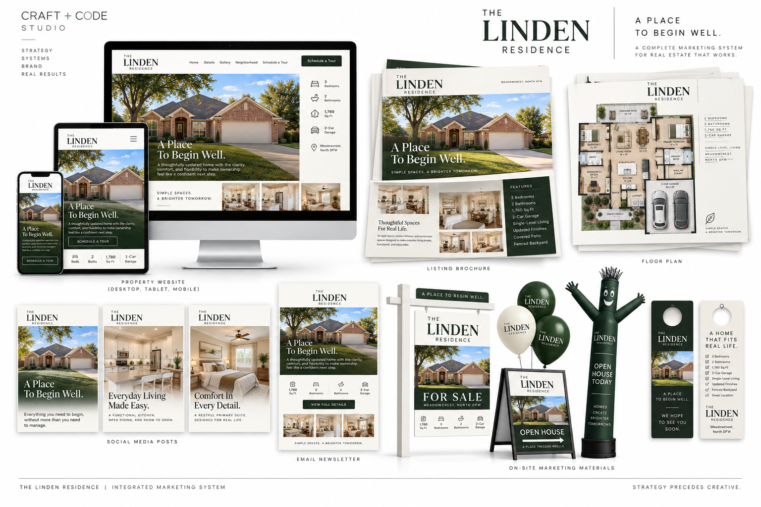
The digital experience answers the first questions quickly: price, condition, space, daily usefulness, and how to schedule a visit. Desktop, laptop, tablet, and mobile preserve the same hierarchy so the opportunity remains understandable wherever the buyer begins.
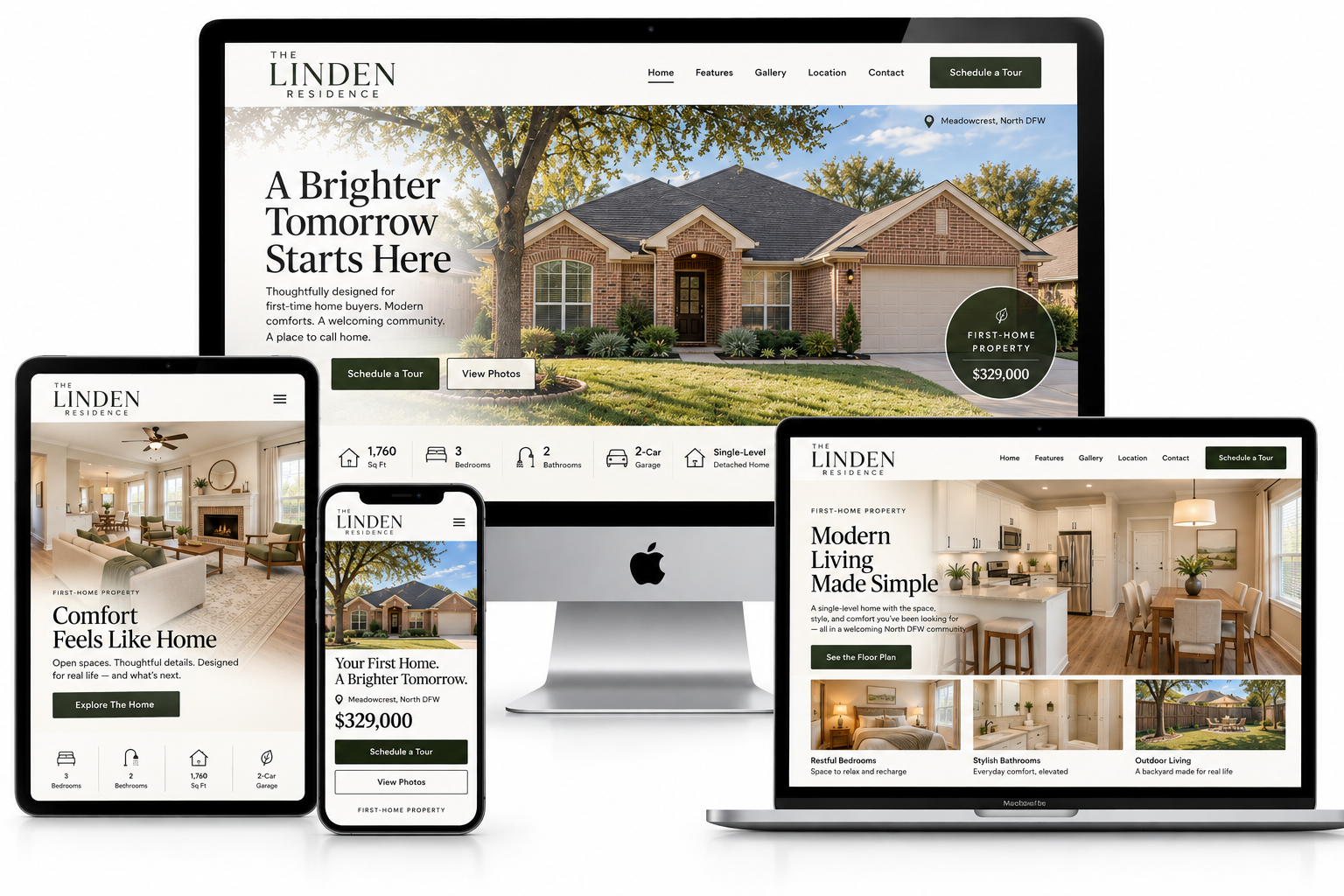
Visual direction
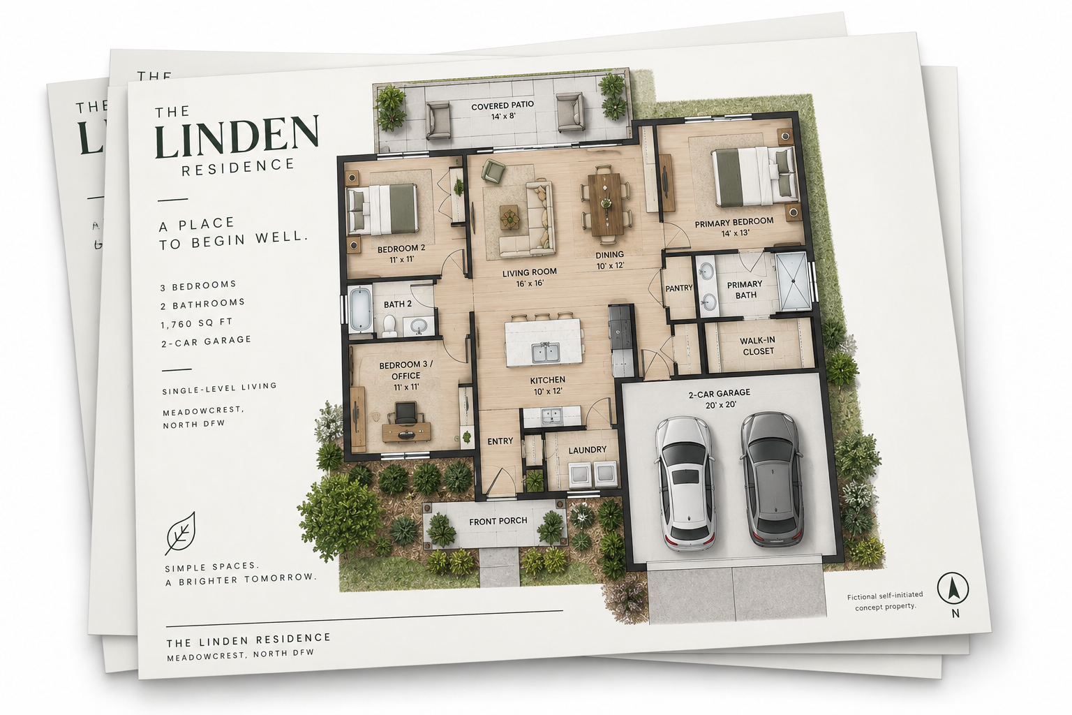
Bright photography, calm neutrals, deep green, and an orderly editorial structure give the campaign credibility without making the home feel overproduced. The brochure balances aspiration with useful detail, presenting the residence as a thoughtful beginning rather than a lower-tier alternative.
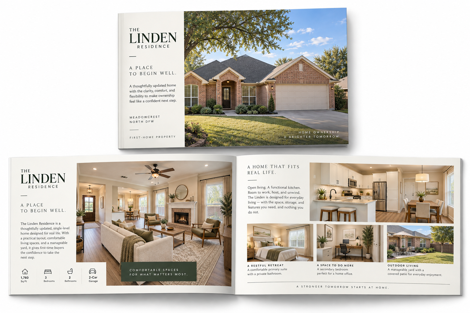
Message priority
The campaign establishes the home as move-in ready and manageable, then supports that promise with the layout, storage, yard, neighborhood access, and essential property details. The sales sheet and floor plan reduce ambiguity without overwhelming a first-time buyer.
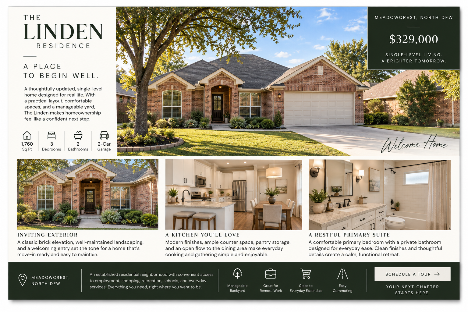
Channel emphasis
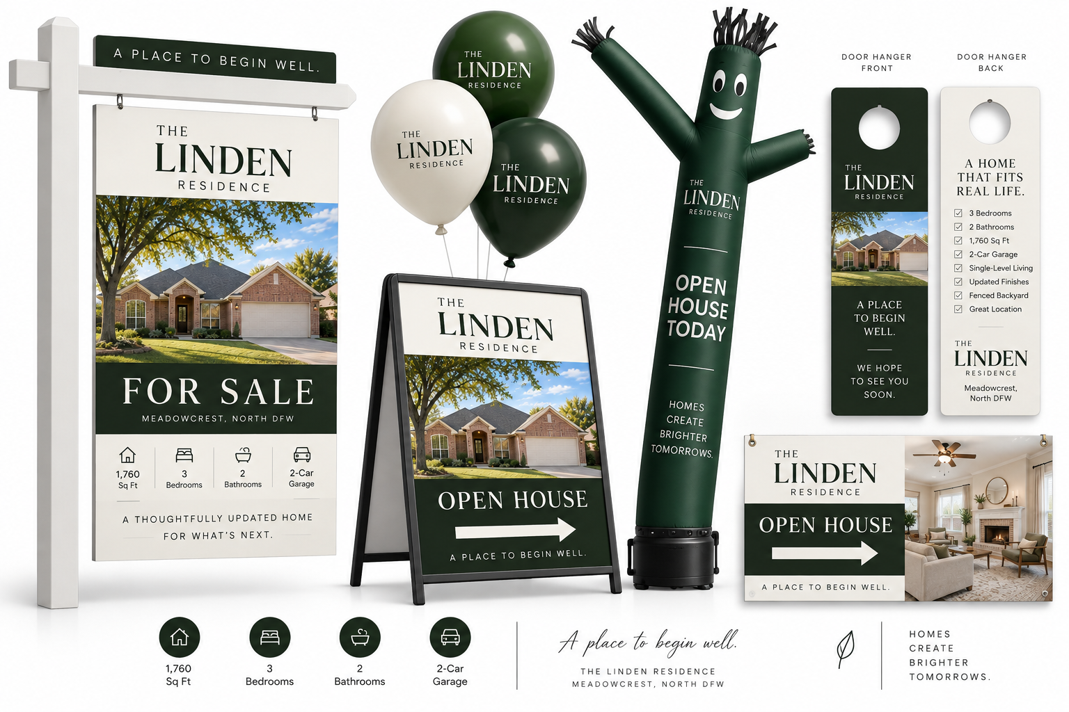
Email and social build awareness with practical reasons to consider the home. Signage and open-house materials make the campaign visible in the neighborhood and support the visit with consistent details, direction, and reassurance.
Complete integrated system
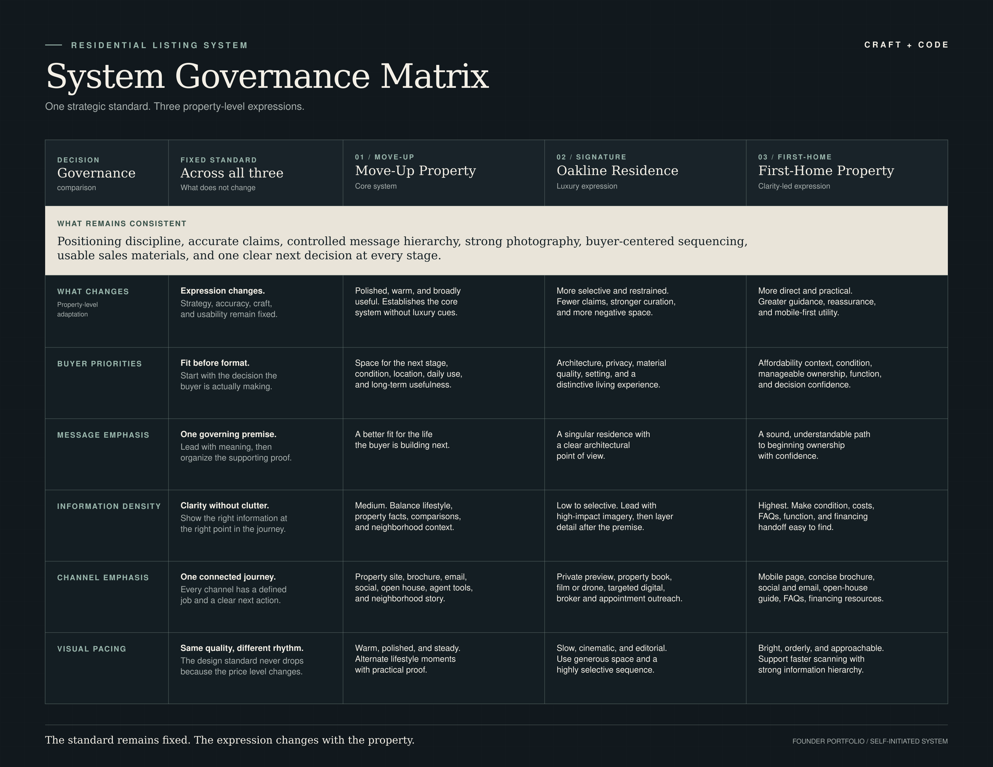
03 / System governance
The matrix defines what Craft + Code protects across every campaign and how buyer priorities, messaging, information, channels, and visual pacing adapt at each property level.
04 / Required system
This repetition is intentional. It proves that Craft + Code has a controllable process, not three isolated design ideas.
05 / Example campaign page
One sentence defining why this property deserves attention from this buyer.
The priorities, questions, and objections the campaign must address.
Typography, color, image direction, pacing, and the reason those decisions fit the strategy.
Show the brochure, landing page, email, social, signage, and video treatment together.
Compare the three campaigns and identify the standards that remain consistent across all of them.
06 / Recommended build order
Start with the Move-Up property. It is the best test of whether the system can feel polished without relying on luxury cues. Once that works, extend upward to Signature and downward to First-Home.
Prove the core system under normal market conditions.
Reduce, elevate, and increase editorial restraint.
Increase clarity and utility without reducing design quality.
Build the final governance spread showing one standard across all three levels.